|
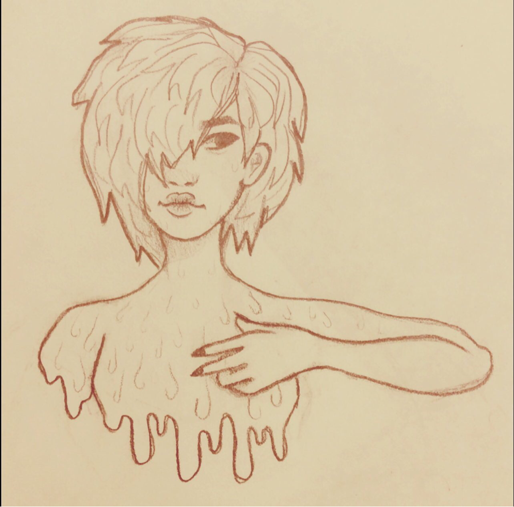
Ring around.When I was making this I also was drawing Melting because I like the little bust sketches that I do (even though thats what I do nonstop anyways but oh well I like how it looks). I thonk this and the other drawing both have a weird concept to them but that's what I like.
|
Gate. |
BonesWhen i was working on this piece i was really impressed with how i drew the sketch. But when i started working on the final it looked too different from the original sketch that i was upset with myself but i gave up and made it a little different from the sketch and it looked better. I wanted to make a drawing like this because i have a strange appeal to weird creepy art. I like how you don't need to connect any emotions with it unless you want to.
|
|
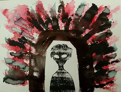
For this project I wanted to do something that could come across as dark and mysterious in a way. I used liquid watercolor, black and red printmaking ink and the two ways I printed was geli printing and relief printing. The boy in the middle was made using black ink and a relief block.I wanted him to look in a way emotionless so the viewer could portray the emotion however they want. The gate around him was supposed to be more of a red color but I messed with the ink too much and I didn't want to waste it so it's kind of a maroon color now. I made the gate because with the watercolor around it it looks like a gate to somewhere dark like another world or like hell or something like that. I wanted it to have a messy chaotic type of look to i went all out with the water coloring and used a big brush. I like how this turned out
|
|
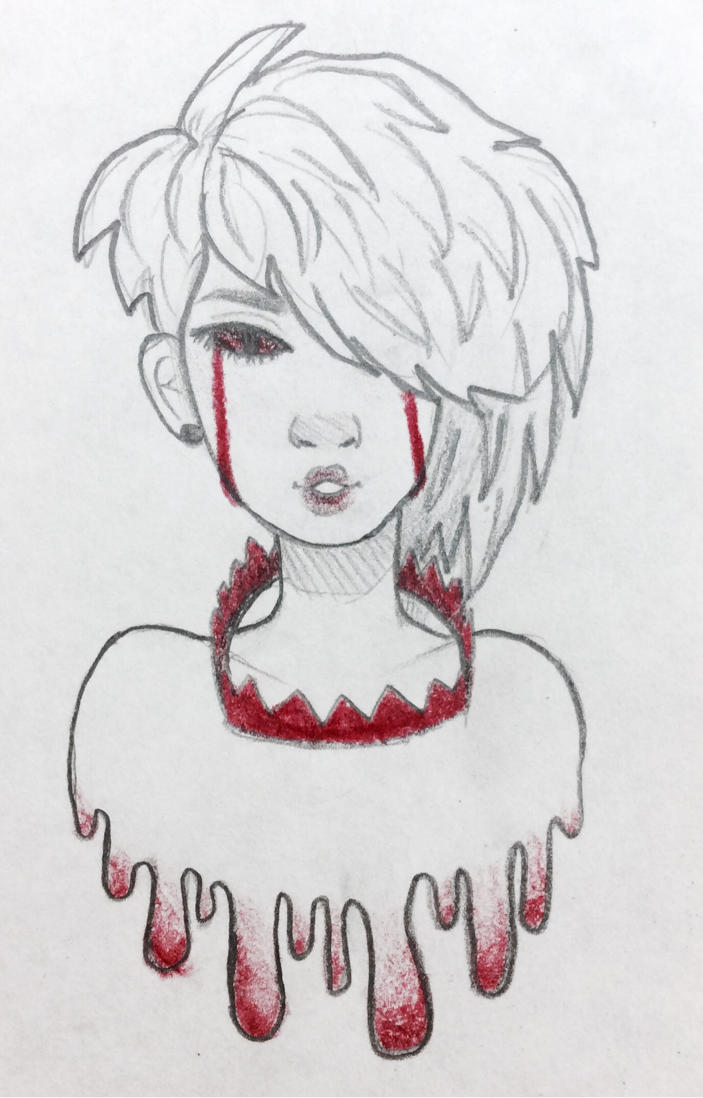
Melting.When I started drawing this i didn't know that it would then out this well so I kept working on it and made sure that she stayed with this theme of like, melting???? i wanted it to look like she was melting it might look like jist water or something but I dunno i just wanted to draw those little drip drops
|
|
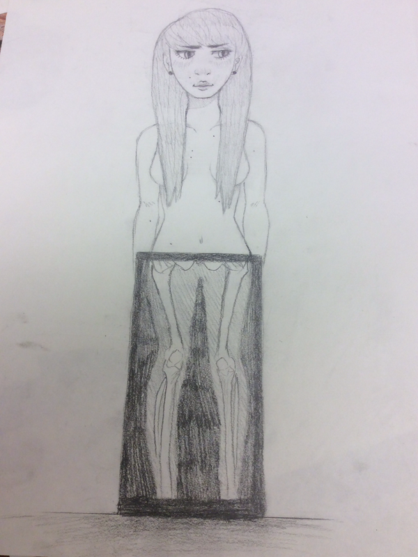
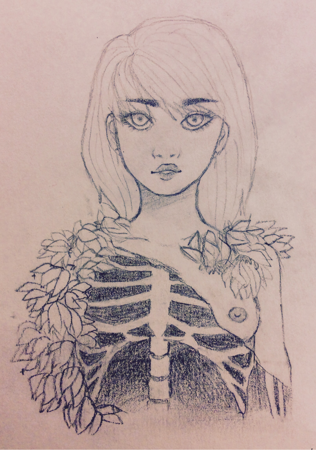
Flowers for her.When i started drawing this i didnt reslly have a plan until I decided to add more bones so i kept going with that plan then I thought that adding flowers would be a good touch to make it a little less ?? creepy and a little more pretty. Im strange you put some flowers next to dead thing and boom its super pretty now wow. as for connecting a drawing to a specific emotion i hsvent gotten to that yet because i dont really think its necessary with this kind of drawing. i like the person looking at it to decide what emotion they get from it on their own
|
Enigma Tarot. |
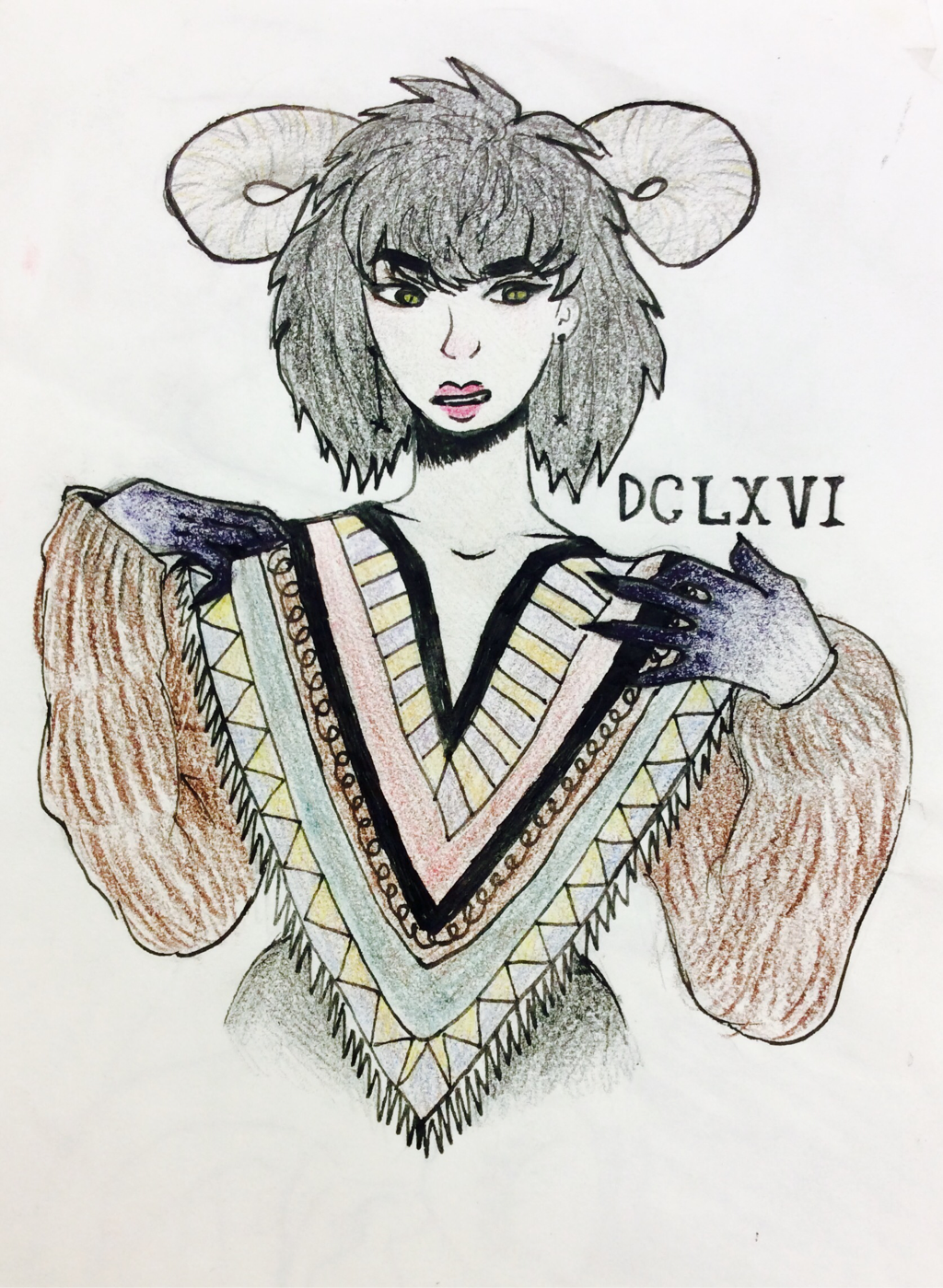
DCLXVI.When I started making this project I had a specific thing in mind because I saw a tumblr post of someone with purple dye all over their hands and it looked cool and witchy so I wanted to make a drawing modeled after that post. I like how it turned out but I feel like I could have changed some of the coloring into something more fitting but I wanted to get it done and I felt like adding a whole bunchof colors so I just did this. Im actually pretty happy on how this turned out because usually coloring things worries me because I'm afraid I'll ruin it, but it tuened out okay. Once again for this, I didnt really want people to look at it and feel some kind of emotion, I just wanted it to look cool.
|
|
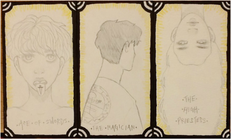
I started this project originally for my friend because he's really interested in tarot cards and reading them. I like them too because he taught me about them and I thought it was really interesting and could be a good long term art project since it gives me flexibility to have different ideas behind each card since each card has a different deep meaning. The Ace of Swords card upright means mental clarity, strength, and creativity, The reversed card means there's a lack of mental clarity and understanding. The High Priestess card upright means higher powers, intuition, and mystery. The reversed card means that there's a need to listen to your inner voice. The Magician card upright means power, skill, and concentration. The reversed card means manipulation and poor planning. I plan to do most of the major arcana instead of all 70+ cards in the other arcanas, but someday I might continue this project to eventually have the entire set.
|
X.
|
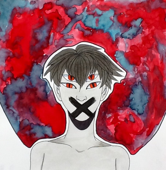
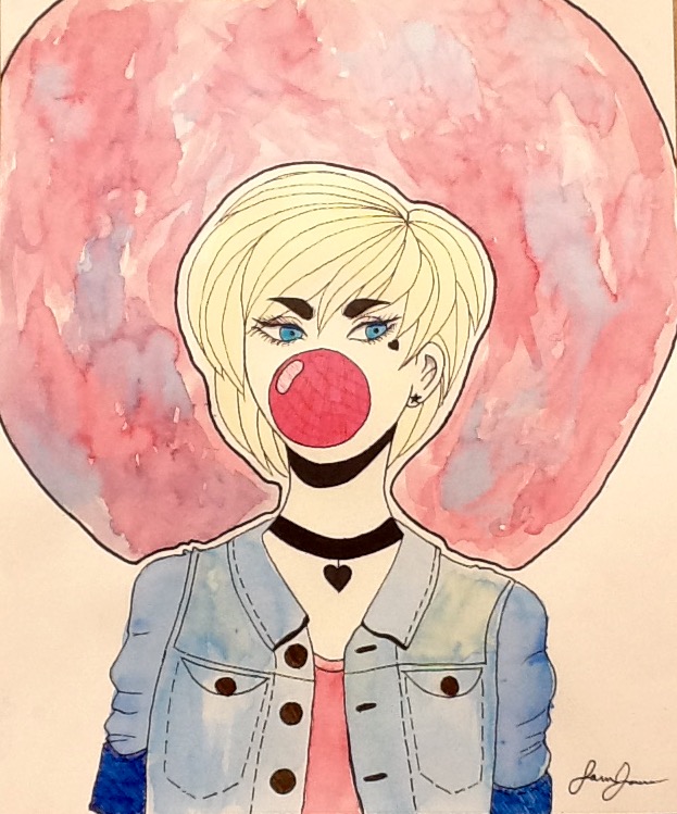
I made this piece to match Bubblegum in a way. I liked the look of the circle of watercolor around the girls head. I wanted to do kind of an opposite to it because Bubblegum is very cutesy and pink, so I made this one a little creepy and I used darker colors. I;m thinking of making these types of paintings into a series of the same theme, which is the watercolor background, the mouth covered, and fine markers used for details and lineart.
|
Bubblegum.
|
When making this piece I only started with the face and the first thing i made was the bubble in the middle. This piece is different from what I normally do because I usually keep all of my drawings on the smaller side and I only draw using pencil. I really love how watercolor looks even though I need to improve my skills on it. For this painting I used black sharpie to outline and micron pens to color in her eyes and the bubblegum and also to add details on the jean jacket. I really love how this turned out because it shows that if i go a little bit out of my comfort zone I can do more than I thought I could. I really like the colors in this and how the blue and the pink compliment eachother in the circle around her head and on her outfit. I kind of wish the outline was a little bit more even and clear but since you can't tell if you don't look really closely I don't mind it as much. For the feeling of the piece, I think it can be depicted any way the viewer wants to but for me it looks like she's sassy and cool.
|
|
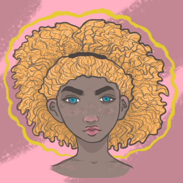
Summer GirlHonestly, I'm really proud of this. It's not often I'm able to draw digitally but i really like to and it's something i want to continue to do. When I drew this first on paper I thought this girl kinda reminded me of the summer time so i took that idea and put it into the colors i have in this piece. I want to continue using the same brush for different drawings because i like the look of it. I think this piece is one of my best works because of the colors and the methods that i used to trace it to make it something new.
|
